From a Paper Map to a Problem Split: How I Built a Portal for Analyzing Orienteering Races
My daughter has an orienteering competition almost every week. Some are regional, some are national, and sometimes the starts run two or three days in a row.
When she finishes, the result is already known: her place, her total time, the protocol. For me, though, that is only the beginning of the analysis. What interests me far more is where exactly the time was lost, why it happened, and whether the same problem repeats from start to start.
I used to do this with another service. It let me look at some of the data, but the analysis itself was awkward. It was hard to georeference a map properly. I couldn’t mark the control points on it or automatically cut a GPS track into splits, and the player was not much use for looking at a run in detail. Most importantly, I couldn’t upload a competition protocol and compare each leg with the other participants.
The result was plenty of data and no answer to a simple question:
what exactly should she work on?
That is how my portal for analyzing orienteering came about.
The project has one more unusual feature: an AI agent wrote all of its code. I never saw a single line of the source. I set tasks, opened the result in a browser, checked it on real competitions, and formulated the next task. More on that later. First, what actually had to be built.
First, the Paper Map Has to Become Data
At the start of an analysis I have an ordinary orienteering map. Essentially it is an image: a photo or a scan of a sheet with the course, the start, the control points, and the finish printed on it.
The GPS track lives in a completely different world — geographic coordinates.
To combine the two, the map first has to be georeferenced.
The portal does this in three steps. First I upload the image. Then I mark at least three corresponding points on the orienteering map and on an ordinary base map. After that the image can be tied to real-world coordinates. Internally the portal uses an affine transformation, and the placement of the whole image is calculated from those few reference points.
Once the map is georeferenced, I digitize the course itself: I mark the start, every control point (CP), and the finish on the image. Because the map already knows where it sits in the real world, each click is automatically converted into the geographic coordinates of a control point.
So the input was a picture. The output is a digital route with a sequence of CPs.
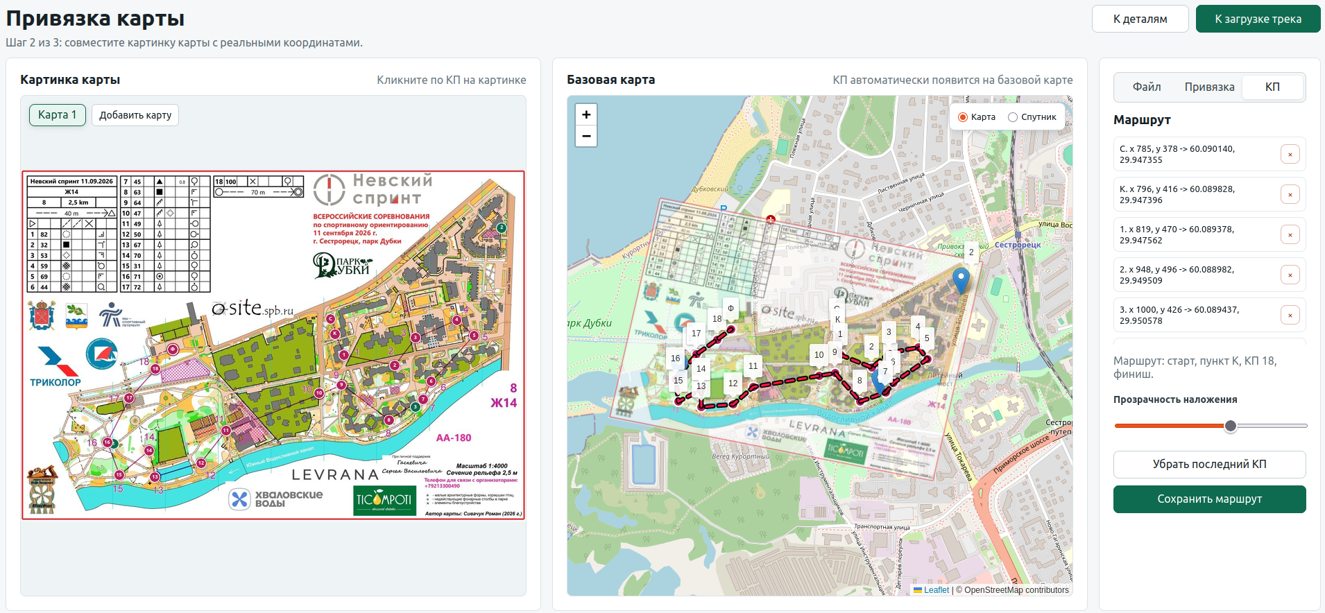
Digitizing an orienteering map: the original scan on the left, the overlay on the base map in the middle, and the sequence of control points on the right. The screenshot shows the Russian-language interface.
Upload the GPX Once, and the Portal Cuts It into Splits
The next source of data is the GPS track from the watch.
By this point the portal already knows the coordinates of every CP. So after a GPX file is uploaded, nobody has to tell it where one leg ends and the next begins.
For each control point, the portal looks for the place where the track passes closest to its coordinates. Those points are used to cut the GPS track into splits automatically: start → CP1, CP1 → CP2, and so on to the finish.
The actual trajectory immediately appears on the map relative to the digitized course.
It looks like a small feature, but this is where raw GPS points turn into something you can work with as a sports result. Each leg now has a start, an end, a time, the length of the actual track, and a pace.
GPS is, of course, not perfect. At some starts the position of a point can drift, and the moment of passing a CP is not always determined perfectly automatically. That is why the portal keeps manual correction of the markers. The automation does the bulk of the work, and a person can fix the result where the real data turned out to be messy.
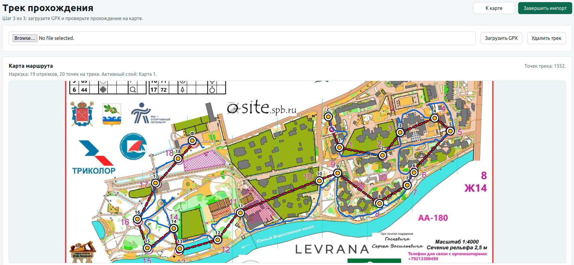
After the map is georeferenced and the CPs are digitized, an uploaded GPX file is automatically matched to the course and cut into splits. The screenshot shows the Russian-language interface.
The Protocol Is Not Just About the Final Place
After the map and the track I already have a good picture of how the course was run. But it is still unclear how well or badly each individual section went.
That requires the official competition protocol.
Importing protocols turned out to be less tidy than I would have liked. There is no single format: over time the portal learned to parse several sources and variants of HTML, JSON, and PDF, and then separate cases appeared, such as multi-day starts, relays, and other competition formats. A change on an external website can still break a particular importer — that is the unavoidable price of integrating with other people’s formats.
But once the import is done, the interesting part begins.
For each split separately, the portal finds the participant who posted the best time on it. These results are then assembled into a synthetic row that I call the “Ideal Leader”.
It is not a real athlete. One person may have been fastest on the first leg, another on the second, a third on the third. The Ideal Leader is put together from the best splits actually posted across the whole course.
The portal then analyzes my daughter’s run relative to that benchmark.
I like this approach better than a simple comparison with the winner. The winner of a competition may have made a mistake somewhere too. Here, every individual leg has a local reference: the best time anyone actually posted on it.
In the protocol you can immediately see on which splits the gap is small and where the main loss happened. Good and problematic sections are highlighted in color, and from any cell you can open a detailed analysis of that split.
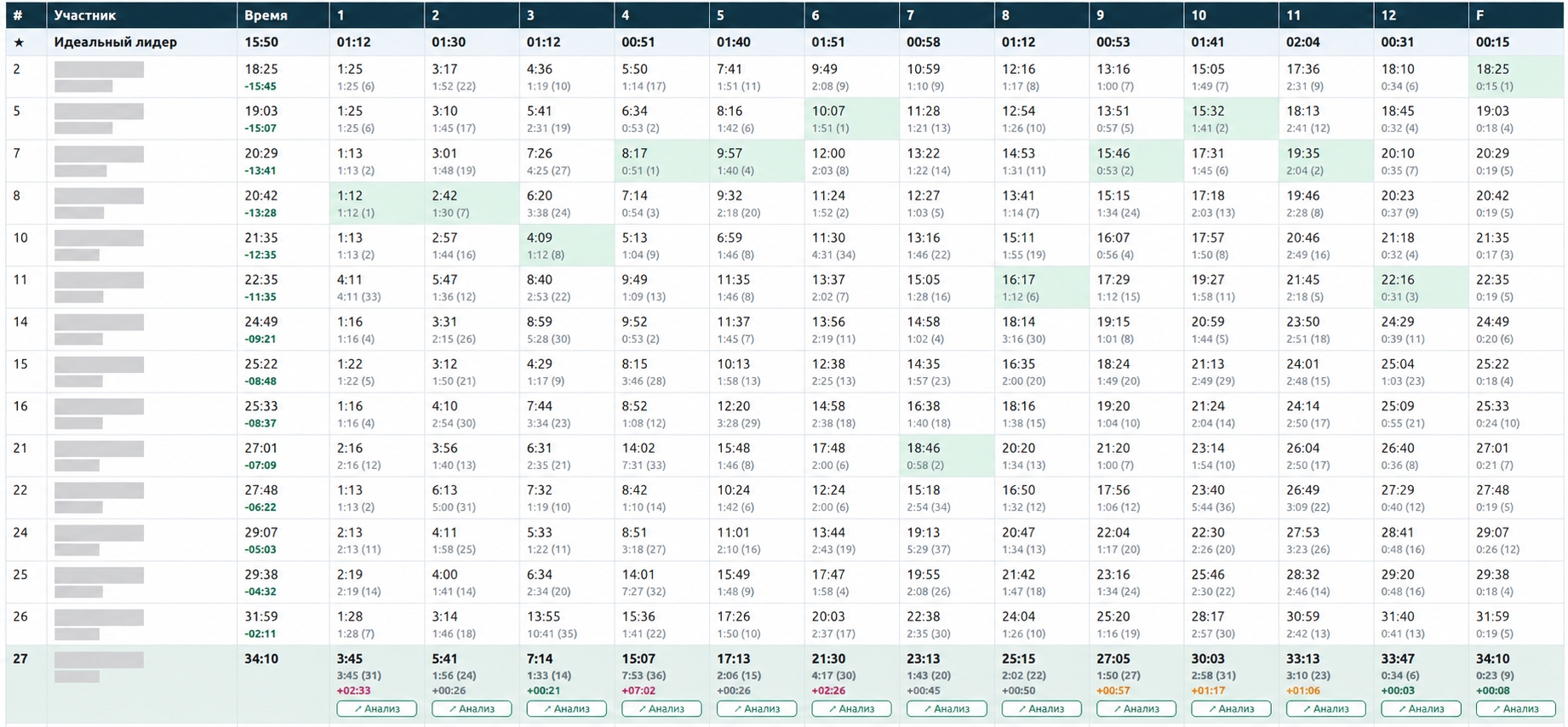
The “Ideal Leader” collects the best time on each leg from the results of different participants. Athletes’ names are hidden; good and problematic splits are marked with color. The screenshot shows the Russian-language interface.
First You Have to See the Whole Run
After the map, the GPX, and the protocol are combined, the result is a screen for the entire run.
The large map shows the complete actual route. You can play it back like a recording: move through time, speed up playback, and see where the athlete was at any given moment.
Below the map is a pace chart for the whole run. On the right is a table of splits with time, length, gap, and pace.
At this level the portal performs the first automatic analysis. It highlights good and bad splits: the sections that deserve attention after the finish.
It is important to separate two things here. A red split does not mean the program already knows the cause of the mistake. It says: “this is a section worth looking into.” The cause only appears at the next stage.
This is what spares me from having to review the whole course with equal attention. If a run lasted more than an hour, I don’t need to hunt manually for the few most interesting minutes. The portal narrows the search area in advance.
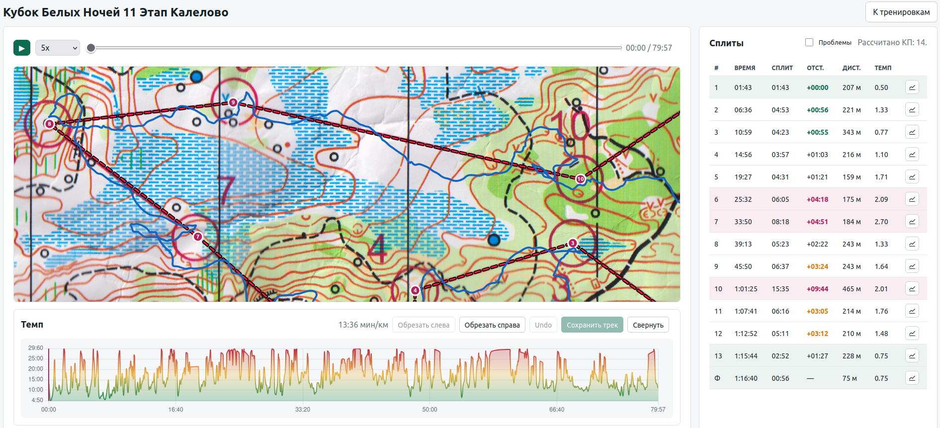
The whole run in the player: the actual trajectory, the pace, and automatic highlighting of good and problematic splits. The screenshot shows the Russian-language interface.
Then the Whole Course Shrinks to One Problem Section
When you open a specific split, the interface changes completely.
The rest of the course is no longer needed. The portal cuts out only the piece of the orienteering map that belongs to the selected leg. What remains on it is the actual GPS track and a straight line between the two CPs.
This makes for a very clear comparison. For example, the straight line between two controls may be 300 meters, while the actual track is 820. On its own that does not prove a mistake: in orienteering you can’t simply draw a straight line through a swamp, a fence, or an impassable area. But a gap like that immediately makes you look carefully at the route choice.
Below the map, a pace chart is drawn for this split only. Instead of the noise of the whole course, what remains is exactly the context needed to analyze a few minutes of the run.
Here I can also record the cause of the problem. When there are many analyzed sections, the causes start to turn from notes about individual competitions into statistics.
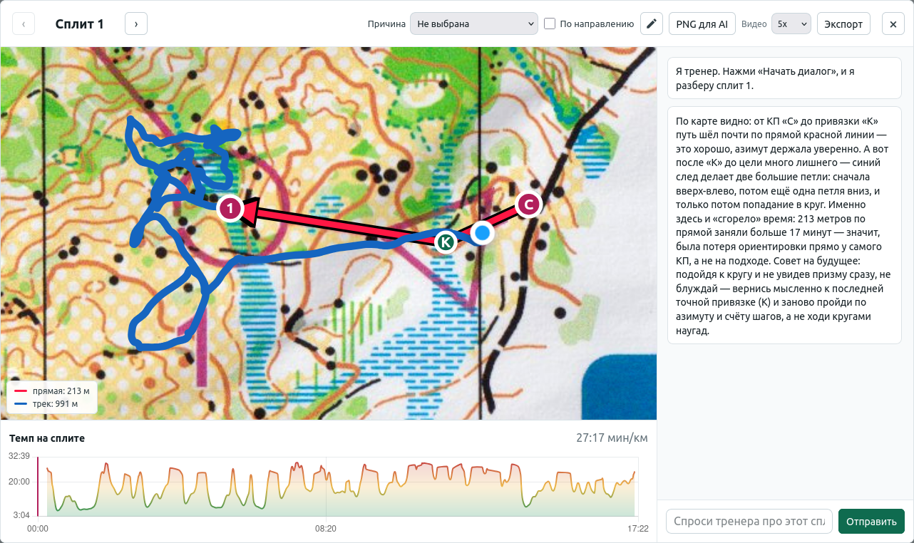
Analysis of a specific split: the map and the track help you see the route choice, the chart shows the pace, and the AI coach gives a short analysis and a next step. The screenshot shows the Russian-language interface, including the AI coach’s reply in Russian.
The Same Split Can Be Sent to an AI Assistant
The split screen has one more layer of analysis.
When I launch the AI assistant, it does not receive the whole competition database or a text description like “the fifth control went badly.” The portal prepares the context itself: it makes a PNG of exactly the part of the map currently shown on screen, together with the track and the control points, adds the numeric parameters of the split, and builds the prompt.
Then Claude is launched through the CLI. The AI has to look at the selected section, try to identify problems in how it was run, and give recommendations.
What interests me here is not so much the “ask the AI” button itself as the preparation of the context before it. Most of the work has already been done by the portal: the right split is selected, the rest of the course is discarded, the map is prepared, and the pace, distances, and gap are known.
In other words, the AI receives not a bag of raw data but an almost ready-made statement of a specific problem.
Even so, I don’t consider this part solved yet.
The AI can offer an explanation and recommendations. But whether those recommendations will actually help change the training process and reduce such losses at future starts is a completely different question. The portal has not proven that yet.
And this is where, for me, the most interesting boundary of the project currently runs.
When There Are Many Mistakes, You Need Statistics, Not a Single Race Review
A single bad split may be an accident. So on the main screen I no longer look at one run.
On the left, the portal collects a queue of problem splits that are still worth analyzing. It includes sections with a noticeable gap and a low pace.
On the right, the causes of the problems already analyzed accumulate. And this is where information of a different level appears: not “there was a mistake on the fifth split last Sunday,” but “this type of problem repeats more often than the others.”
For example, in the current data the top problem may turn out to be not a navigation error at all, but “low pace without a mistake.” That is already a very different conversation. If a person chooses the route correctly, doesn’t lose the map, and doesn’t go off to the side, but systematically loses on pace, then the next hypothesis about training will be nothing like the one for constant direction errors.
On the same dashboard I can see how her places at competitions have changed over time. It is a rough metric — different starts can’t be compared perfectly with one another — but it gives a general background for the more detailed analysis.
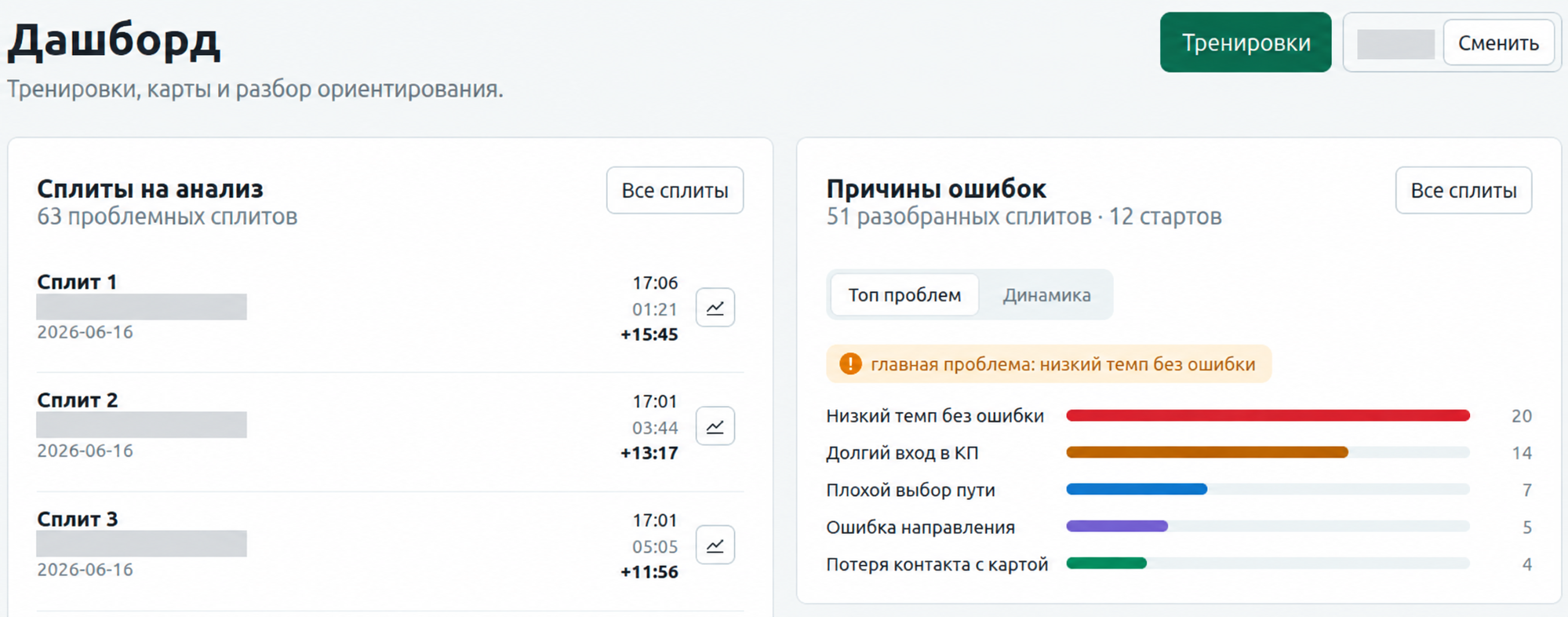
Once enough splits have been analyzed, individual notes turn into statistics of recurring error causes. The screenshot shows the Russian-language interface.
There is one more experimental view of a result: reachability analysis. The portal takes the participants who finished higher, groups them by the size of the gap, and shows not an abstract distance to first place but closer steps.
For me it is a way to phrase a realistic question. Not “how does she become first,” but, for example: how many seconds need to be won back to move up to the next group of results, and can that time be found in how the course is run?
I would not put a separate picture for this in the article: the user’s main path is already visible well enough on the six previous screens.
I Did Not Write a Single Line of Code for This Portal
Now, about how it was developed.
I am a developer, but on this project I deliberately did not work as a developer in the usual sense. I did not open the source code and I did not do code review. The AI agent wrote 100% of the portal’s code.
My work looked different.
I saw a problem in real use and set a task. The agent implemented it. I opened the portal, loaded real data, went through the user scenario, and looked at whether my problem was solved. If not, I formulated the next task.
That is how georeferencing, automatic GPX splitting, import of different protocols, split comparison, the analysis card, error causes, the dashboard, and the AI assistant appeared, step by step.
For me the acceptance criterion was not the code but a working product.
That does not mean the technical side is left completely unchecked. The repository has automated tests; on the state of the project I checked, a full run gave 109 passed. But I evaluated the system from the outside — as a user who knows what result is needed.
This mode changes the role of the human considerably. If the agent has taken over writing the code entirely, the main question is no longer “how do I implement this?” but “what should be implemented next?”
And the agent did not answer that question for me.
The Hardest Problem Appeared After the Portal Started Working
From a technical point of view the portal can now do quite a lot.
It turns an image of an orienteering map into a digital course. It overlays a GPX track. It cuts the track into splits automatically. It pulls in the official protocol. It builds the “Ideal Leader.” It shows where time was lost. It lets me open a specific leg. It helps classify the cause. It collects statistics on recurring problems. And it can even pass a selected section to an AI for an additional analysis.
But it was right after that that I ran into a question I had barely noticed at the start of the project:
what do I do with the problem once I’ve found it?
Say the portal shows that the main recurring factor is low pace without a navigation error.
Fine. We know that.
But what training action follows from it?
Or the AI looked at several problem splits and gave recommendations. How do I tell whether they are right? How do I turn them into a specific exercise? How do I check, a few weeks later, that this particular problem has started to occur less often?
I don’t have a good answer yet.
And that is probably the most useful result of the whole project. At first I thought the main thing was to learn to collect data and find mistakes. Now that part is increasingly automated, and the difficulty is moving further along: from diagnosis to changing behavior and the training process.
Why I Keep Doing This
My wife, my daughter, and I analyze every start together. We open the track, look at the lost minutes, and discuss what happened on a particular section.
I can’t yet say that the portal has made her results better. I don’t have the data for such a conclusion.
But the project has one more goal that is hard to measure with a chart.
I hope my daughter sees how involved we are. That her competitions are not just “so, how did the run go?” for us, and that we are genuinely interested in looking at the map together, understanding a mistake, and noticing progress.
If the portal ends up also helping to turn the statistics of mistakes into good training decisions — great.
But even now it has already solved the first task: instead of a general assessment of the result, we have a concrete conversation about specific sections of the course.
And that turned out to be far more useful than simply knowing the place at the finish.